Digital

Cult of Distraction

Digital

Cult of Distraction is a content site chock full of editorials and reviews by the very amusing and witty Nick Fisher. He’s a web developer by trade and a freelance writer for Mandatory, but this is his pet project where he gets to write about everything he’s passionate about – movies, video games, books, and other stuff he likes getting distracted by. The site is getting revamped where we want to improve the UX/UI by making it look more modern and intuitive to navigate around. My responsibilities involved creating the new design with a responsive layout, prototyping the navigation, and refreshing the logo. The development is still in progress, but the design itself is finalized to showcase.


The previous logo is little outdated, so I started redesigning this first. It retains similarities from the old, but I updated the look to be simpler and played with the negative space on the face and punctuation marks.


2016 Logo


New 2019 Logo


With the new layout, I started off designing the desktop view first. The article images will be the main focus to grab the user’s attention while the text is secondary, but prominent. The design is prepped to be responsive and easy to shift around for the other breakpoints. I wanted to keep the site mostly monochromatic with a red accent since the content images would be colorful enough by themselves. As for the tools used for this, the site was designed in Sketch and prototyped through Invision Craft.
The prototype for desktop is available to be viewed where you can check out the sections of the site and see sample reviews and editorial pages. Please choose between two options depending on your monitor’s resolution: Desktop Prototype & Desktop HD Prototype


This is the tablet breakpoint where the position/size of the tiles will be shifted. A prototype is also available for this, but I limited the frames and navigation since most of it has been exemplified on the desktop version: Tablet Prototype


This is the mobile breakpoint where the position/size of the tiles are shifted again. A prototype is also available for this with the limited frames and navigation: Mobile Prototype


After working on this project, I’ve been doing additional research on other prototype options to see what other features can be offered. I plan to experiment more and apply this to upcoming website/app projects when possible.

Acknowledgments:

UX/UI Designer: Angela Truong | Developer: Nick Fisher

TotalBeauty Awards 2019

Digital

Every year, TotalBeauty.com rates the latest beauty products from their readers to determine which ones are the best in their categories. After reading all their reviews and counting up the votes, they promote the winning brands on their site. I worked on multiple materials to promote this event. Since it’s their 10th anniversary, we went with a celebratory theme with the makeup brush acting also as a burst of confetti. Below are a few samples that showcase some of my work for it.


Many e-mail newsletters and call for entries were sent out to attract more beauty brands and voters to participate. Some were animated to give it extra oomph while the others were kept more simple. Here are a few examples I worked on.


TotalBeauty also got the word out by promoting their event on social media. I created graphics for Instagram, Facebook, Twitter, and many other sites for this purpose. I also designed an MREC pop up sweepstakes form that appears on the awards page before you start voting.

Acknowledgments:

Designer, Art Director: Angela Truong | Design Support: Alex Tostado, Carlos Sanchez | Creative Director: Joey Inigo

Mandatory Media

Digital

Mandatory.com is a men’s lifestyle site that brings you interesting news, funny photos, and overall fun editorial content. They recently launched their corporate site to promote their brand, showcase their latest works, and act as a digital media kit for prospective clients. I worked on the wireframe for the site layout and art directed the look and feel with my team.


This is the static mock of the site with a video demo below it. To visit the site, check it out at Mandatory Media.


Acknowledgments:

Designer: Alex Rivera | Developer: Abraham Vazquez | Art Director: Angela Truong | Creative Director: Joey Inigo

Disney’s Oz the Great and Powerful

Digital

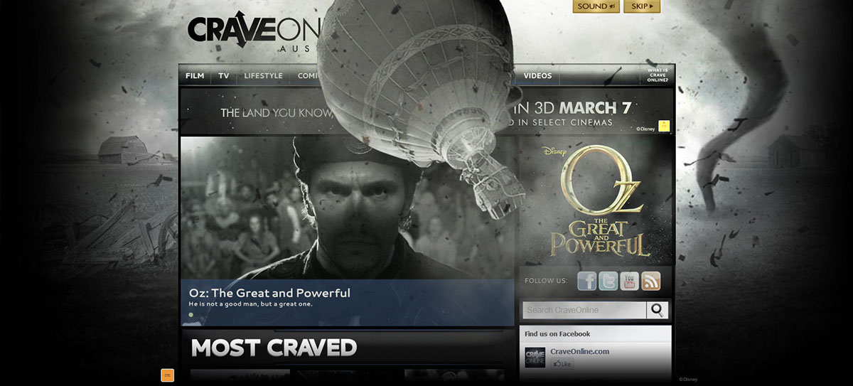
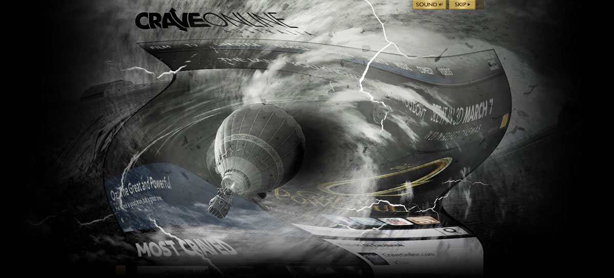
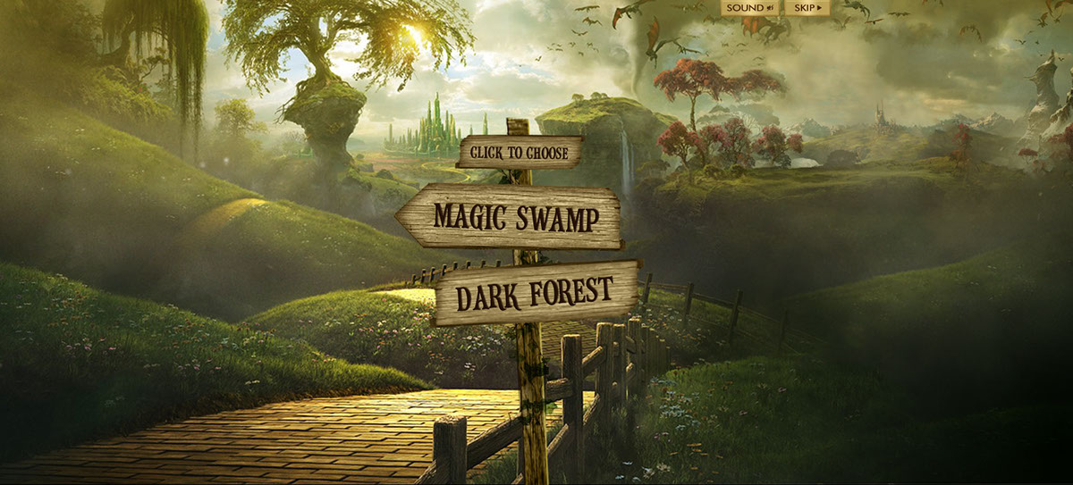
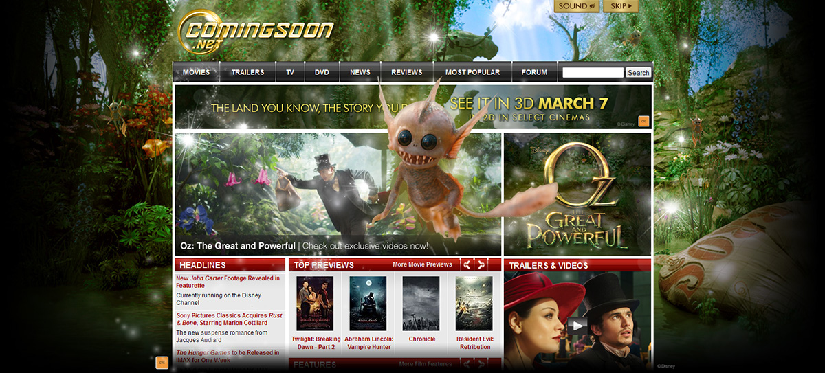
This immersive unit takes the user across multiple websites to experience the land of Oz. I worked on the pitch mocks where this concept became sold and continued to work on the final static designs for this project. After all the designs are approved, the buildout was sent outsourced to Mexico.


The first frame starts off with the tornado wreaking havoc on the CraveOnline site.


The hot air balloon eventually gets sucked up into a black hole.


The black fades into the land of Oz with a sign that lets the user pick between two paths.


If the user chooses the Magic Swamp, it will take them to ComingSoon where the pixies fly out and eventually darts at you.


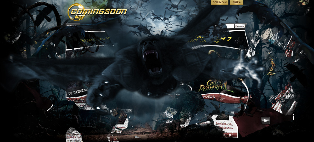
If the user chooses the Dark Forest, it will take the user to the alternate version of ComingSoon where a horde of flying baboons tear through the site while coming at you.


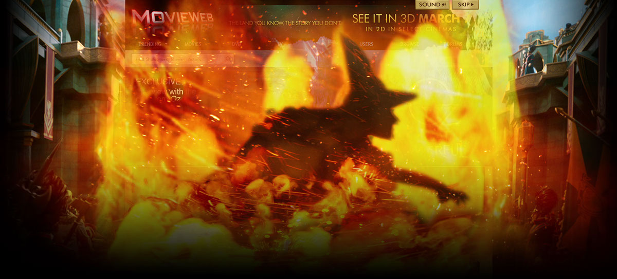
The user eventually reaches the Emerald City on MovieWeb where the wicked witch appears and burns up in the fire.


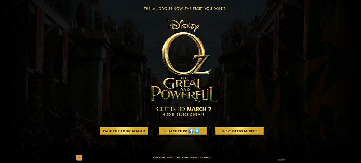
At the end of tour, the user will see the end frame with the movie messaging and options to share the experience, visit the official site or take the tour again.


Acknowledgments:

Designers: Angela Truong, Joey Inigo | Animators: Alejandro Tostado, Hannah Niebla, Ellie Guerra, Isaac Martinez | Art Director: Joey Inigo | Creative Director: Manuel Donayre | Development: Gorilla Nation Mexico

Fanta

Animation, Digital

This project was for a floater unit that revealed the newly redesigned Teenspot website. The concept is to show the old site with characters dancing in the MREC ad. One of the characters would start bumping the sides or pushing up against the site to make it crash down, revealing the new site underneath. The characters dance in celebration as it introduces the new Teenspot in sponsorship with Fanta. I worked on the design of the floater with another designer and put together the animation of the characters breaking the site down.


These are the static mocks for the floater.


This is a video of the animation, which was done in Flash.


Acknowledgments:

Designers: Leny Evangelista, Angela Truong | Animator/Developer: Angela Truong | Art Director: Joey Inigo | Creative Director: Manuel Donayre

Walt Disney World

Digital

Momtastic launched a microsite to promote the opening of the new Toy Story Land in Walt Disney World. The site counts down the days until the new land opens in the theme park. I worked on the design of the site, where the layout works cross device for desktop, tablet, and mobile.


Here is a mockup of the desktop/tablet layout which is responsive to the user’s resolution size. It starts with a countdown clock on the landing page. The rest of the sections feature a hotspot map for the new land and recommendations on attractions and restaurants. The user can scroll down or use the menu on the left to navigate through the site. Here is the live link for the site: Walt Disney World: Roadmap to the All-New Toy Story Land.


This is the mobile layout of the site with sample frames on how the content gets displayed alternatively.


Acknowledgments:

Designer: Angela Truong | Developer: Liliana Iturribarria | Creative Director: Joey Inigo

Transformers: Dark of the Moon

Digital

For this movie, I designed these overlays that took over various sites like CraveOnline, WrestleZone, ComingSoon, and SuperHeroHype. When you roll over the MREC, the site transforms into either Optimus Prime, Bumble Bee, or Shockwave. The video demo of the Optimus Prime example is below along with static designs of the alternate characters.

Accolades Received For This Integration:
• Digiday 2011 Video Awards: Best in Banner Video
• ClickZ 2012 Marketing Awards: Best Use of Display Advertising
• thinkLA 2012 Interactive Awards – Best Use of Display Advertising


These are the static frames from my storyboard which shows what I envisioned during the robotic transformation. I used Optimus Prime as my main example, but the last two frames show the end results with the alternate characters.


Here is the video demo of how the animation looks, where the development was outsourced.

Acknowledgments:

Designer: Angela Truong | Art Director: Leny Evangelista | Creative Director: Manuel Donayre | Animation/Development: PixelShards

Metroid: Samus Returns

Digital

I quite enjoyed this project since I’m a fan of the Metroid franchise. This particular game is a remake with the original on Gameboy, but with better graphics and extra gameplay features on the 3DS. I eventually bought the game and completed it after working on this campaign.

There’s a few concept mocks and ideas pitched to Nintendo, but they ultimately decided on buying a complex overlay promoting general info about the game. Below are the units that went live along with some pitch mocks. I managed a design team in Serbia where this project was outsourced, but I also took part in doing the design along with providing art direction for it.


This is the complex overlay that was sold to Nintendo. It features multiple tab sections with game info, videos, a gallery, and a special section about their amiibo. I provided the art direction for my team in Serbia to work on this. Eventually, I took part in doing some of the design with them because of the difference in work hours along with revisions requested both internally and from clients.

This is the mobile version of the unit since it was sold as cross device.


Here are some of the pitch mocks that were presented to Nintendo. The first mock is the cover slide for an elevate unit, which is a webpage article with parallax animation. The concept of this mock is to feature an editorial about the Metroid series since its first Nintendo game up until its latest with the 3DS. The pagination at the top is a navigation option for the user to go through different panels of the webpage, but only the first panel is mocked for this pitch as a sample.


For the complex overlay, an out of player 3d animation concept was initially pitched where the effects from the trailer fly out of the 3DS console. I worked with Serbia to create this frame where Samus is blasting metroids out of the screen.


This is a gallery slider unit where the concept is to feature the various weapons and items that can be found in the game. This unit was also a collaboration between me and my team in Serbia.


Acknowledgments:

Designer, Art Director: Angela Truong | Designers: Borivoj Ivanovic, Grujica Samardzic | Creative Director: Joey Inigo | Developer: Liliana Iturribarria

Super Mario Odyssey

Digital

Super Mario Odyssey is one of the big games released for the Nintendo Switch. I worked with my team in Serbia where I provided art direction for them to design the pitch mocks. Once the campaign has sold, I worked on the units that went live, which was the animated billboard, overlay, and reskin.


This is the animated billboard unit where the user sees an intro animation before it resolves to 3 video options to watch on the end frame. I worked on the design and video editing for the intro animation.

The unit is cross-device where I designed a mobile version of the layout.


This is a simple overlay unit where the video plays on a branded background. I resized the key art for this design.


The key art was also resized for this reskin unit where the imagery lives on the gutters of a website.


A couple of pitch mocks were presented to Nintendo before they eventually decided to go with the 3 units above. One was a hotspot overlay where the user could click on the world map to learn more about each land to explore. I provided the art direction to my team in Serbia to come up with this design.


This was another pitch mock I worked with Serbia on, where they designed a gallery slider billboard that provides more info about the characters. Two sample frames were mocked for this.


Acknowledgments:

Designer, Art Director: Angela Truong | Designers: Miodrag Spasevski, Grujica Samardzic | Creative Director: Joey Inigo | Developer: Liliana Iturribarria

Fancy Nancy

Digital

Fancy Nancy is a TV show on the Disney Junior network that was based on a children’s picture book. The cartoon revolves around a little girl named Nancy who loves everything fancy. The unit we built for Disney is a game overlay where the user looks for all of her favorite things like butterflies, tea sets, and other items within her 360° closet.


These is the preloader to the game where it has an animated SVG loop of a butterfly.


This is the intro screen where it plays the video trailer and lets the user start the game.


This is the starting screen once the gameplay initiates. The text eventually fades away as you pan around the room to look for the hidden items.


Once you click a hidden item, a popup confirmation appears to show that you’ve found it.


After all the items are found, an end screen popup will appear.


Here is a video demo to show how the gameplay looks on the unit.


Acknowledgments:

Designer, Animator: Angela Truong | Developer: Liliana Iturribarria | Creative Director: Joey Inigo